
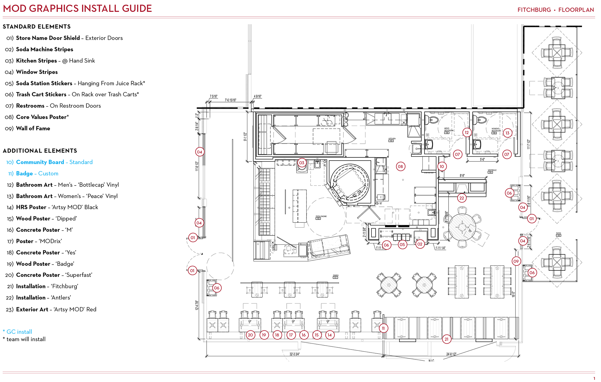
Above is a simplified floorplan, that I had cleaned of all dimensions, with callouts so the installation crew knew which walls to put each graphic piece. Graphics schedule not shown for proprietary reasons.
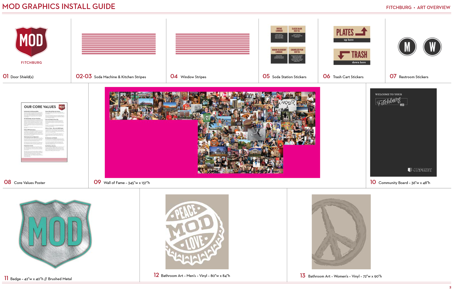
These assets were what we referred to as "Brand" art. Most of the collections in our library were standard pieces that I created working Illustrator files for, but others (like items 9 and 11) were uniquely customized for the store. The Wall of Fame files were the only assets created in InDesign per the print vendor’s preference.
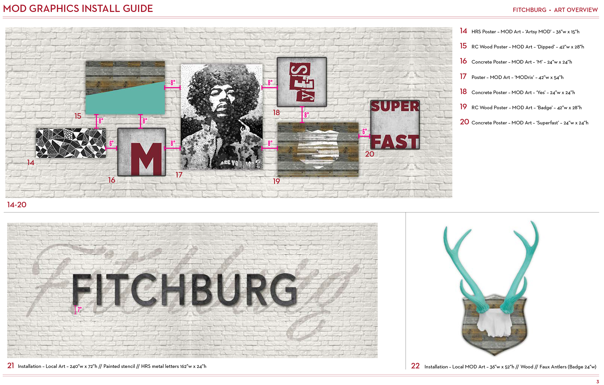
These pieces of art were completely custom and unique to this particular store. I created production files calling out a variety of materials such as wood, metal, paint and concrete. Often times, I was given just flat *.jpg’s or rough sketches to base my production files off of, rebuilding the working files completely from scratch.
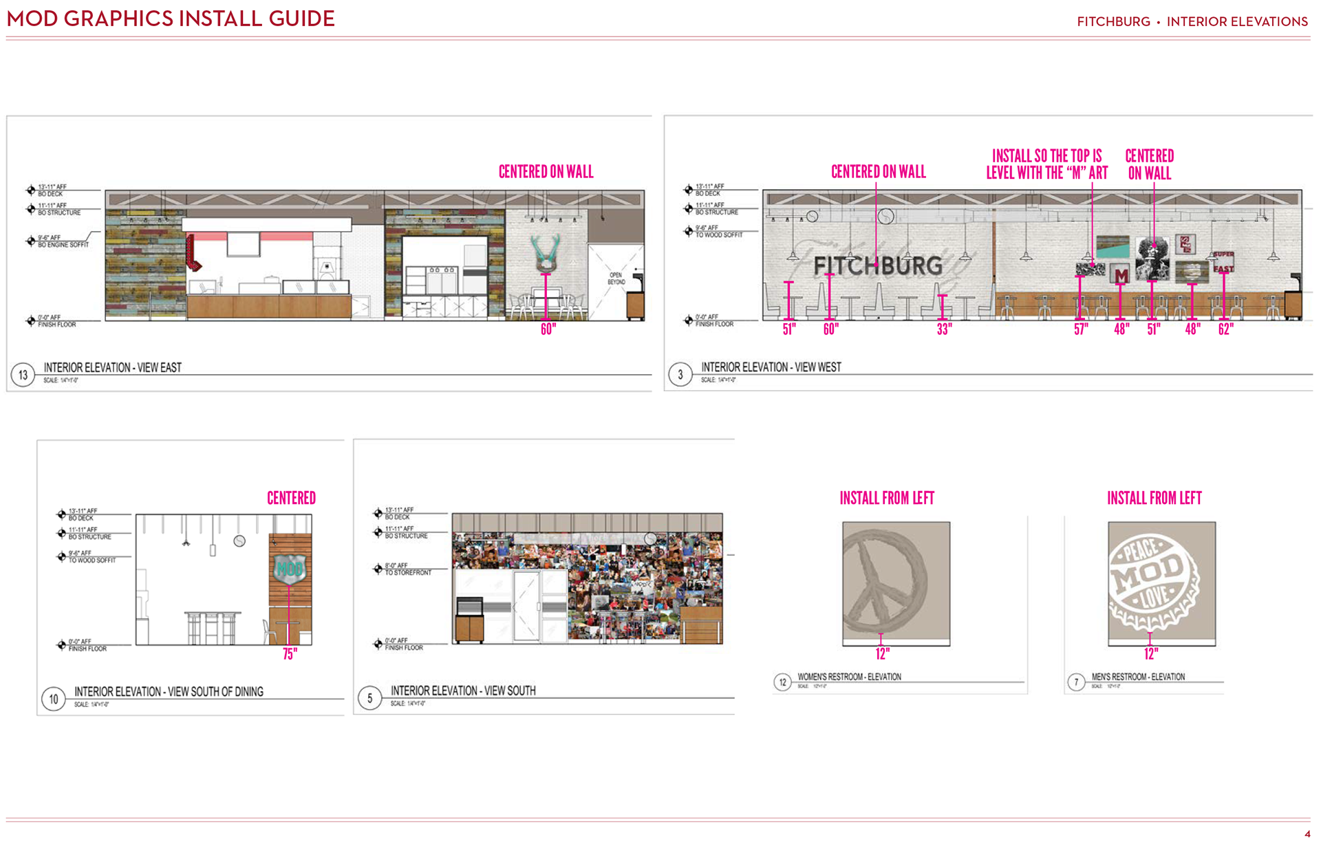
This is an example of the simplified/scrubbed elevation plan with clear indicators of the art positioning and recommended placement heights.
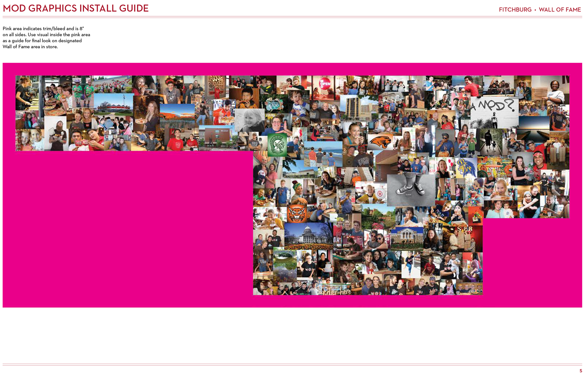
Because these giant "Wall of Fame" pieces had very large bleeds to accommodate for wall variations, this mockup is basically to show the installation crew where the actual intended visual images start and where they end (so the bleed to be trimmed has been hidden behind hot pink. Why hot pink? This is to easily differentiate between the photos and the edge of the cut, even at a glance.) Otherwise they would just start adhering from the bleed edge and create a whole mess of alignment issues.
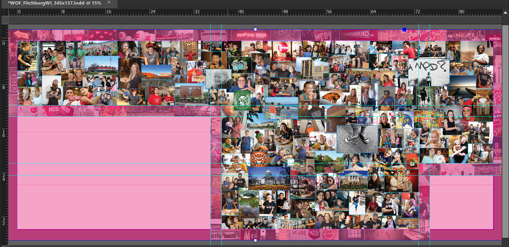
This is a behind the scenes screenshot of my InDesign production file for this massive "Wall of Fame" collage that ran along the east wall. This one is comparatively one of the smaller ones I built at around 30'. These have very large bleeds in the event of a discrepancy between the floorplans and the actual finished construction.